Rethinking a stone management system

Rethinking a stone management system

Rethinking a stone management system

CLIENT

No permission for company disclosure

ROLE

UX Designer

TIMELINE

7 months

RESPONSABILITIES

RESPONSABILITIES

Design and deliver new product

Organize the team

UX strategy for UK

Design and deliver a redesigned product

UX strategy for UK

UX strategy for industry

Context

The company hired me to redesign the client's stone management tool, focusing on the experience of platform users.

Challenges

There was already a platform created to serve customers in the stone sector, but there were features that weren't being used by operators. It was necessary to understand the reason, and offer solutions to this problem.


The system has been created without any user feedback. I did an audit to make sure about the actual state and found some problems such as:

  • Lack of consistency between components and flows;

  • The information in the forms is not grouped by theme, to help with filling out;

  • Absence of hierarchy in typography, in order to facilitate and guide the reading.

HIGH LEVEL GOALS

Generate better use of the tool by users

Automating work in the stone processing industry

Increase product relevance to customers

Increase product relevance to customers

impact

Unfortunately, I don't have any information about changes in performance.

DESIGN PROCESS

This is the design process that I created for this project.

DISCOVERING THE CHALLENGES

I had some hypotheses about the tool, which I then tried to validate through interviews with users.

The hypotheses were:

  1. There are many features and screens that the client is not using;

  1. The programming screens are not meeting the customers' needs, they are laid out in a way that is difficult to understand;

  1. We believe that the client has used other ways of organization (spreadsheets, papers, etc.), leaving the platform aside.

  2. Using a mobile device would make it easier to maintain the transmission data and record information.

I created a script and interviewed 8 workers who operate the cutting, polishing, and resin machines in the industry. The questions were focused on the routine of how they do it today, evaluation of the experience with the platform, and ideas for improvement.

The interviews were carried out in the industry, work environment of the interviewees.

Some points stood out in the interview:

All respondents use the platform on a daily basis in a common work day, the tool is extremely important in their routine, but they don't use all tools.

Elimination of paper

They still use a lot of paper to document processes. Transporting these forms to the platform could facilitate the routine and ensure more security for the information.

A mobile responsive version would not be helpful.

They deal daily with corrosive substances and a lot of dust, which would make it difficult to handle a cell phone or tablet to take notes on the desktop.

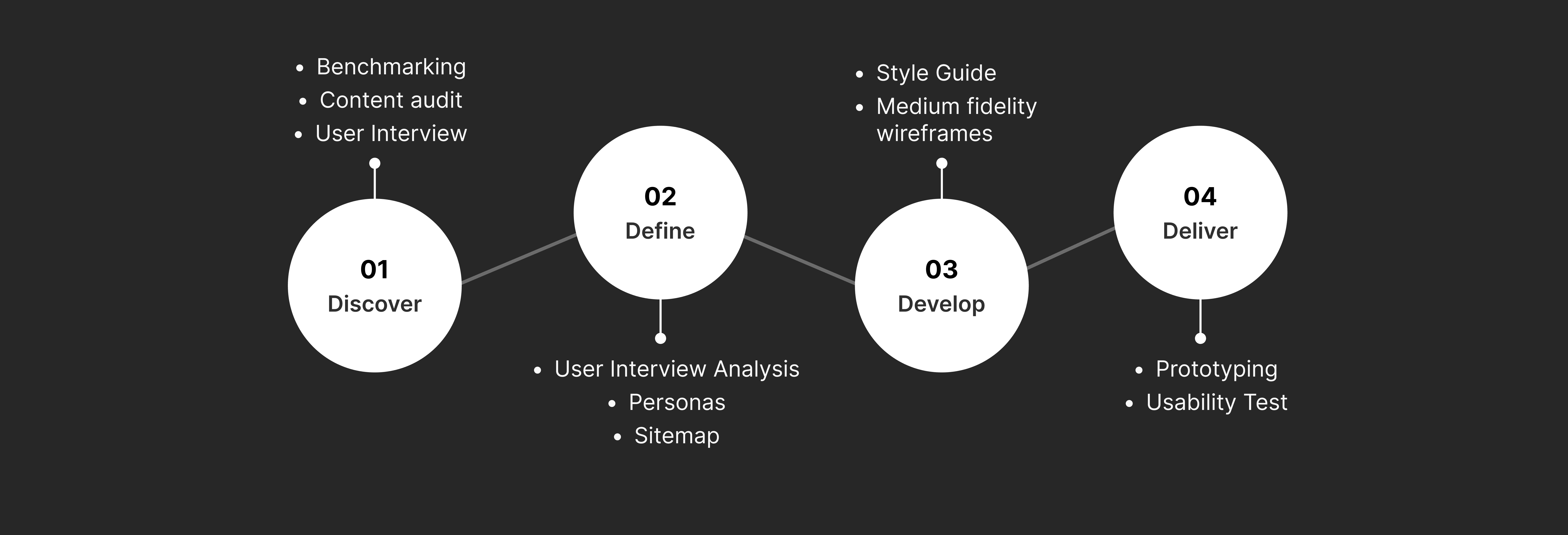
building the persona

At that moment I already had the necessary information to start the ideation process, so I drew the persona, in order to summarize the knowledge acquired in the discovery, to then go on to create screens.

analyzing the process

In order to understand the process and possible bottlenecks, I built a complete flow of how the rocks that arrive in the industry are managed. Note the post-its in orange, they all report processes that are done through a printed form, thus corroborating the employees' main complaint.

building the style guide

I started creating the style guide, keeping the brand colors and creating auxiliary colors for feedback and alerts needed on the platform. I opted for Lato typography, for fluid reading and easy cognition. For the components, I used the icons and components provided by Material Design as a basis.

wireframing

I started creating sketches for the screens in medium fidelity, in order to validate the functionalities and flows before proceeding to create the prototypes. The main objective at that time was to transform the opportunities for improvement found into functional and simple-to-use screens.

  • Paper forms replaced by virtual forms on the platform;

  • More simplified screens in flows;

  • Text hierarchy and usability principles properly applied;

  • Guaranteed consistency.

prototyping

With all the specifications prepared, I started creating the prototypes, then applying the built styles and creating the components in their final version. These are some of the screens created (the brand was hidden to ensure customer confidentiality).

in retrospect

I planned to run a usability test, but I had some difficulties in the execution, such as:


  • The choice of the type of experiment was not the best for the scenario. I tried to meet the customers' requests and apply a test in Figma, providing the simulation of use in the navigable prototype. Today I would opt for the Maze tool to collect more assertive information about specific flows, not about all flows.


  • The budget cap had already been compromised by the other steps, so customers thought it best to carry on as it was, without running another test.

in retrospect

Of the 7 printed forms that the workers used, I was able to scan 2. It was not possible to scan them all, as the distances between the machinery and the computer are generally large, and therefore paper makes this inspection work easier for taking measurements. In addition, the company has not shown itself to be open to a suggestion of using a tablet with factory protection.


I planned to run a usability test, but I had some difficulties in the execution, such as:


  • The choice of the type of experiment was not the best for the scenario. I tried to meet the customers' requests and apply a test in Figma, providing the simulation of use in the navigable prototype. Today I would opt for the Maze tool to collect more assertive information about specific flows, not about all flows.


  • The budget cap had already been compromised by the other steps, so customers thought it best to carry on as it was, without running another test.